

Campbell’s redesigns soup cans for 1st time in 50 years
FILE- The redesigned Campbell's soup can. Credit: Campbell's Soup Company
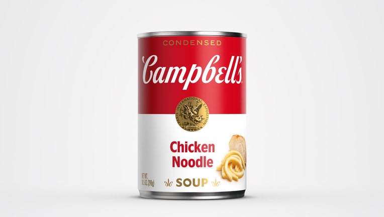
The labels on Campbell’s soup cans are getting a "modernized logo scripture," which includes eliminating the shadow and a slightly changed font, according to the company.
Fans of the iconic soup franchise will notice that the iconic red-and-white colorway will remain the same and it’s only the scripture on the label receiving changes.
The new logo scripture was based on founder John Campbell’s original signature. The cans also feature other hidden elements for those who pay attention to detail.
RELATED: Recipe: Steak and wild rice soup
The hidden elements include the Campbell’s "C" in the fleur de lis and slanted "O" in the soup that pay tribute to the letters from the first red-and-white label in 1898.
"We’ve been on a journey to reimagine this iconic brand and appeal to new generations of consumers who are cooking at home more than ever, while still honoring our rich history," Campbell Chief Marketing Officer Linda Lee said.
Cans that received the redesign are tomato, cream of chicken, cream of mushroom and chicken noodle soup.
To celebrate the launch, Campbell is taking a step into the digital art world by releasing its first-ever Non-Fungible Token (NFT) with proceeds benefitting the Feeding America organization.
Campbell partnered with street style artist and illustrator Sophia Chang to help create the NFT art piece.
"The commissioning of our first-ever NFT art piece pays tribute to our place in art and pop culture, while celebrating in the most modern art medium to date," Lee added.
RELATED: Video captures officers rescuing cat that got head stuck in soup can
This story was reported from Baltimore.