

Show Your Stripes Day: How a colorful graphic raises awareness of climate change
The first day of summer is also Show Your Stripes Day.
The observance was created five years ago to raise awareness of climate change. At the center of the effort is a colorful graphic called "Warming Stripes."
HOW TO WATCH FOX WEATHER ON YOUR TV
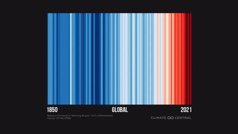
According to Climate Central, a nonprofit independent group of scientists and communicators, the concept was created by climate scientists Ed Hawkins. It features lines of various shades of blue and red that are stacked left to right, indicating how temperature has changed for a given location over a certain amount of time. Blue represents a cooler than average year, while red represents a warmer than average one. Darker colors represent a bigger departure from average.
In the example below, the stripes represent the global temperature change from 1850 on the left to 2021 on the right. The bulk of the world’s warmest years in the past 172 years have happened in the past few decades.
MAGIC MUSHROOMS: SCIENTIST SAYS FUNGI COULD REVOLUTIONIZE CLIMATE CHANGE FIGHT
How to create a ‘Warming Stripes’ graphic for where you live
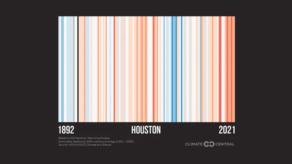
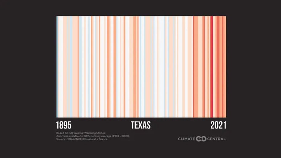
Climate Central has created "Warming Stripes" graphics for 179 cities, 49 states and the globe that include available data up to 2021.
To find the graphic for your city, click here and select your location from the drop-down menu. Here’s an example for Houston.
To find the graphic for your state, click here and select your state from the drop-down menu. Here’s an example for Texas.
GET THE LATEST EPISODE OF THE FOX WEATHER UPDATE PODCAST
You can also go to showyourstripes.info and find graphics down to state level for the U.S.